October 23, 2014
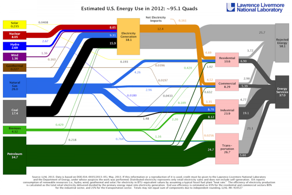
Ever wonder where our country's energy comes from and goes to? This fascinating map from the Lawrence Livermore Labratory shows in simple graphic terms where we generate energy and how much of it goes to various sectors. One of the fascinating aspects of this is everything you see in gray--"Rejected Energy." What this really means is waste. Particularly in electricity, as much as 2/3 of all the energy created is lost during transmission and via other means before it actually does any work. All the more reason to generate your electricity right at home on your roof.


